Usage guidelines
General guidelines
- Use concise descriptive field labels.
- Match field width to intended input to set expectations of required information.
- Avoid placeholder text for hints (use static hint text instead):
- Placeholder text disappears on focus, causing some to forget the hint.
- Placeholder text can make it look like a field is already filled.
- Low contrast is hard to see.
Simplicity by design
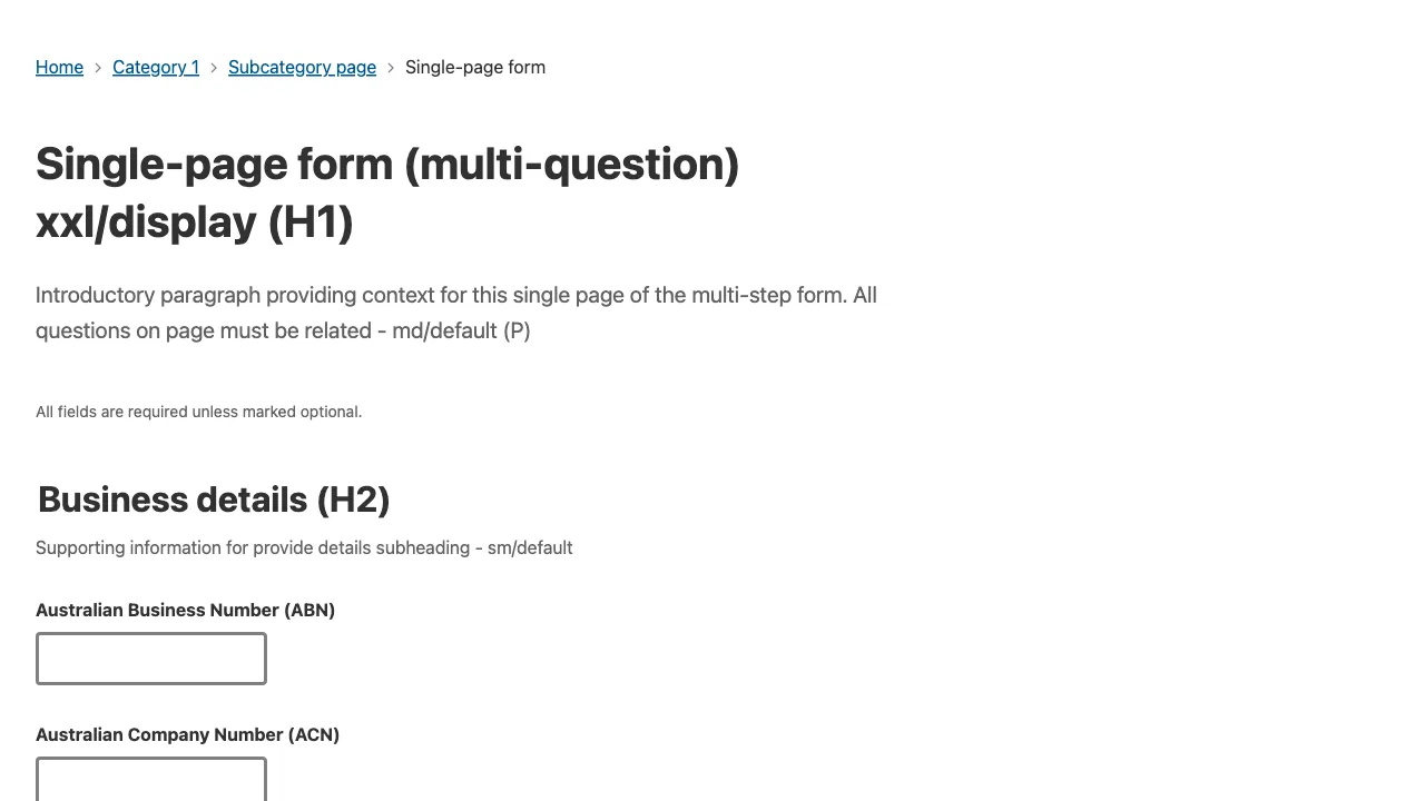
Present forms in a single column layout for efficiency and to avoid people missing fields in other columns (especially those using screen magnifiers).
Try to limit forms to a single question per page. A question could include multiple related inputs, such as a street address. Break up large forms into multiple steps to decrease cognitive load. In cases where this isn’t possible, group related fields using fieldsets.
Required vs optional fields
Try to only ask for necessary information. Avoid optional fields by asking users to opt in first. If you can’t avoid optional fields, indicate them with (optional) in label. Place text at the top of the page that says ‘All fields are required unless marked optional’.
Buttons
Left align buttons, starting with the primary button on the far left. Right aligned buttons can be missed, especially by those using screen magnifyers. Only include one primary button per page.
Use descriptive button text. A simple rule that works most of the time is to start with a verb and end with a noun. For example, ‘Submit application’.
Try to avoid disabled buttons as they can be problematic for some users - They don’t provide feedback why they’re not clickable causing people to get stuck. They are also hard to see for those with poor eyesight, and aren’t natively keyboard accessible.
Instead, allow users to interact with buttons and receive feedback.
Error messages
A form should validate when a user attempts to submit. Validation errors should be summarised as a list inside of a Page alert with the 'error' tone. The page alert should be placed at the top of the form, and focused immediately after a submission attempt. When clicked, each error in the list should scroll and focus the user focus respective form field.
<PageAlert tone="error" title="There is a problem">
	<Text as="p">Please correct the following fields and try again</Text>
	<UnorderedList>
		<ListItem>
			<TextLink href="#field_name">Enter your Name</TextLink>
		</ListItem>
		<ListItem>
			<TextLink href="#field_dob">Enter a valid birth date</TextLink>
		</ListItem>
	</UnorderedList>
</PageAlert>
If only one error is present, the error summary can be omitted and the invalid field can be focused.
An invalid field is highlighted with a red border and a red error message. They should never be covered by autocomplete menus and on-screen keyboards.
<FormStack>
	<TextInput
		label="Name"
		id="field_name"
		invalid
		message="Enter you name"
		required
	/>
	<DatePicker
		label="Date of birth"
		id="field_dob"
		onChange={console.log}
		invalid
		message="Enter a valid birth date"
	/>
</FormStack>
Success messaging
When a form is successfully completed, return the user to the entry point of the form and display a Page alert with the 'success' tone and a clear message which communicates the successful submission. When possible, provide persistent methods for a user to return and see the status of the submitted artefact, for example a reference number.
<PageAlert
	tabIndex={-1}
	tone="success"
	title="Descriptive success message (H2)"
>
	<Text as="p">Supporting paragraph for the success message</Text>
	<Text as="p" fontWeight="bold">
		Reference: 00000000
	</Text>
</PageAlert>