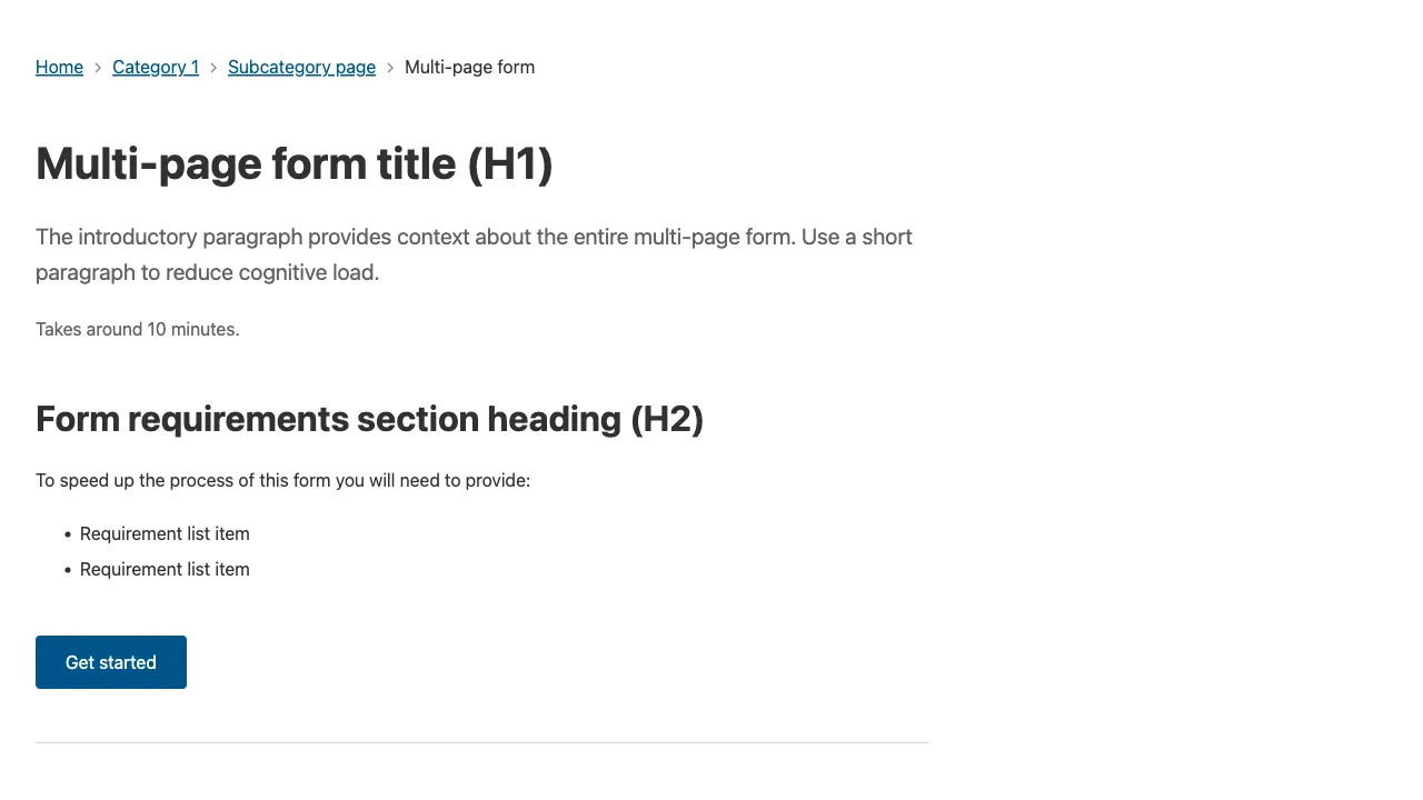
Multi-page form
Use this template to break up large forms into multiple smaller steps to decrease cognitive load.

Usage guidelines
- Try to limit forms to a single question per page (a question could include multiple related fields).
- Place the Progress indicator component in left column.
- The mobile version of the Progress indicator compresses into accordion to ensure it’s not in the way of filling out the form.
- Avoid using disabled buttons in the Progress indicator.
- Avoid adding or removing dynamic list items in Progress indicator.
- Include a sub heading above the H1 to tie form steps together.
- Include a Button group at the bottom.
- Ensure primary button text is contextual, and consistent with the page heading - e.g. ‘Register establishment’. Avoid vague labels such as ‘Submit’.
- Hide Breadcrumbs and Side nav to create focus on the form and reduce distractions.
- Include a ‘back’ link at the top.
Rationale behind having the ‘back’ link at the top:
- It’s a familiar position for the back button on mobile and web browsers.
- It’s a conventional position for secondary navigation - breadcrumbs and back button.
- People can quickly go back to check the previous form.
- There’s less chance of people going back and losing a filled form by mistake.
- It minimises the time for a user to proceed by reducing options near primary actions.
- It maintains accurate visual hierarchy making the back action less prominent than the primary action ‘Continue’.