Progress indicator
Progress indicators show users the number of steps in a task, where they are up to in the process and how much is left to do.
import { ... } from '@ag.ds-next/react/progress-indicator';<ProgressIndicator activePath="#organisations" items={[ { label: 'Introduction', status: 'done', href: '#introduction' }, { label: 'Submit evidence', status: 'saved', href: '#evidence' }, { label: 'Organisations', status: 'started', href: '#organisations' }, { label: 'Business contacts', status: 'error', href: '#contacts' }, { label: 'Case studies', status: 'todo', href: '#case-studies' }, { label: 'Attachments', status: 'started', href: '#attachments' }, { label: 'Review and submit', status: 'blocked', href: '#review' }, ]} />
Progress indicators are used to help users navigate to each step of a multi-step form, show users how many steps are needed to complete a form and how far they have progressed through the process of completing it.
Progress indicators can be applied to larger tasks that can be completed in any order and returned to at a later date, like doing a tax return or applying for a driver’s licence.
Progress indicators can be applied to multi-step forms if the form has a known number of steps to be completed. 1
Avoid adding or removing pages to a multi-step form where a progress indicator is used as this can confuse and mislead users. Consider another approach if the number of steps might change due to user input. 2
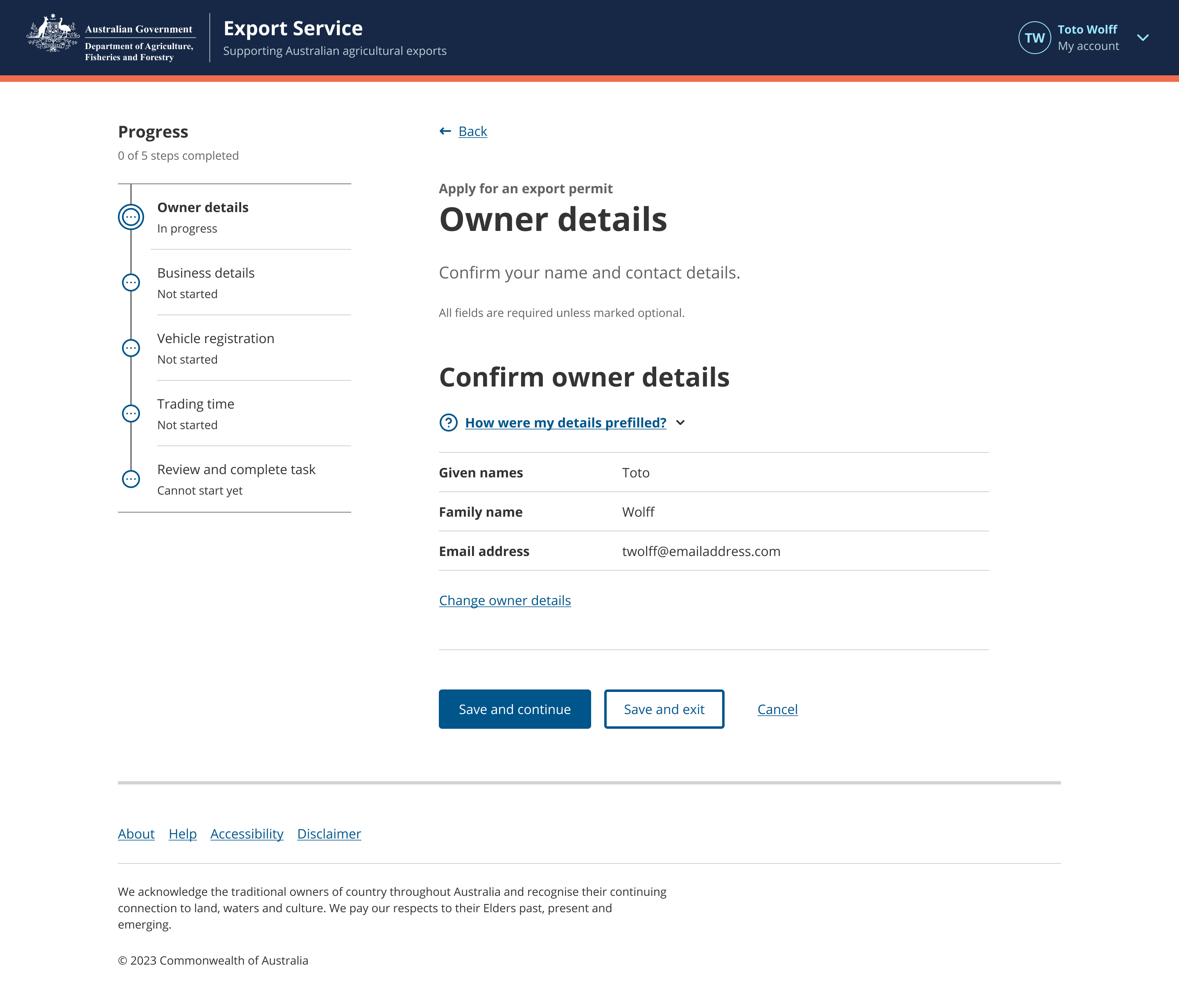
By default, a Progress indicator contains links to each level 1 page of a multi-step form.
When a user navigates to a secondary action page from a level 1 page, a level 2 link is revealed in the Progress indicator to help a user understand where they have navigated to and how to return to the previous step.
Do
- display steps in order from top to bottom
- allow users to navigate to any step
- use in forms and multi-page processes
- use for processes of 2 - 10 steps
- always present the mobile menu closed by default
- use a Task list to guide users through processes with multiple progress managed forms
- ensure step names match H1s and truncate if long
- frontload keywords
- group related steps.
Don’t
- dynamically or conditionally change the number of steps in a progress indicator list
- use for fewer than 2 steps
- disable steps - allow users to navigate to pages and use Page alerts to indicate a step is not available yet
- have any other components in the left-hand column
- add the step number to the text - list only the action the user needs to take
- mix with other navigation patterns - for example, Side nav
- change labels or icons
- make progress indicators a sticky nav item as this may cause reading order issues.
Background
The background of the Progress indicator must match the background it is being placed on.
If the Progress indicator is placed on a bodyAlt background, set the background prop to bodyAlt.
Status
The status prop can be used to indicate the status of each item. The following values are available:
| Status | Label | Description |
|---|---|---|
todo | Not started | This step is available for the user to start. |
started | In progress | This step has been started and still needs to be completed. |
done | Completed | This step is complete. The user has submitted valid data and it has been verified (where necessary). |
blocked | Cannot start yet | This step is not yet available for the user to start. |
saved | Saved | This step has valid saved data that can still be changed. |
error | Error | This step has an error that requires attention. |
Currently active item
To indicate the currently active level 1 or level 2 item, pass in a matching path to the activePath prop, e.g. activePath="/organisations/change-name".
Hiding the sub title
The Progress indicator component displays a subtitle "x of y steps completed" by default. To hide this subtitle, set the hideSubtitle prop to true.
<ProgressIndicator
	activePath="#organisations"
	hideSubtitle
	items={[
		{ href: '#introduction', label: 'Introduction', status: 'done' },
		{ href: '#organisations', label: 'Organisations', status: 'started' },
		{
			href: '#contacts',
			label: 'Business contacts',
			status: 'started',
		},
		{ href: '#case-studies', label: 'Case studies', status: 'todo' },
		{ href: '#attachments', label: 'Attachments', status: 'blocked' },
	]}
/>
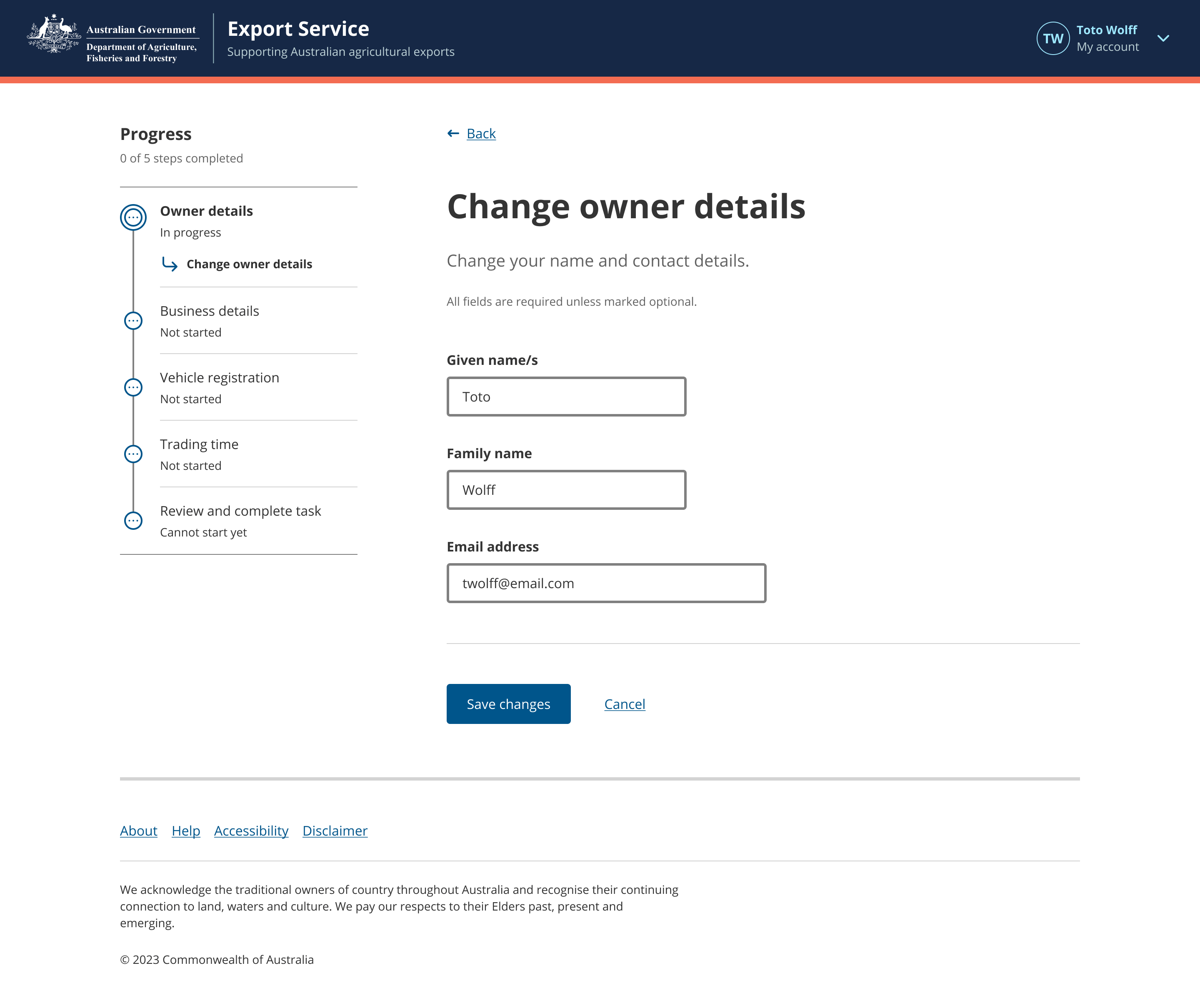
Adding level 2 steps
If a level 1 page has a secondary step, such as editing its content, use a separate page for this secondary step.
When users navigate to this secondary step, let them know where they are by adding a level 2 step item. Only one level 2 step may exist for each level 1 step.
<ProgressIndicator
	activePath="#organisations/add-organisation"
	items={[
		{ href: '#introduction', label: 'Introduction', status: 'done' },
		{
			href: '#organisations',
			label: 'Organisations',
			status: 'started',
			items: [
				{
					label: 'Add an organisation',
					href: '#organisations/add-organisation',
				},
			],
		},
		{ href: '#review', label: 'Review and submit', status: 'blocked' },
	]}
/>
An example of a level 2 step
By default, Progress indicators contain level 1 links to each page of a multi-step form. When additional pages are required for secondary actions under level 1 pages, level 2 links are revealed in the Progress indicator to help a user understand where they have navigated to and how to return to the previous step.
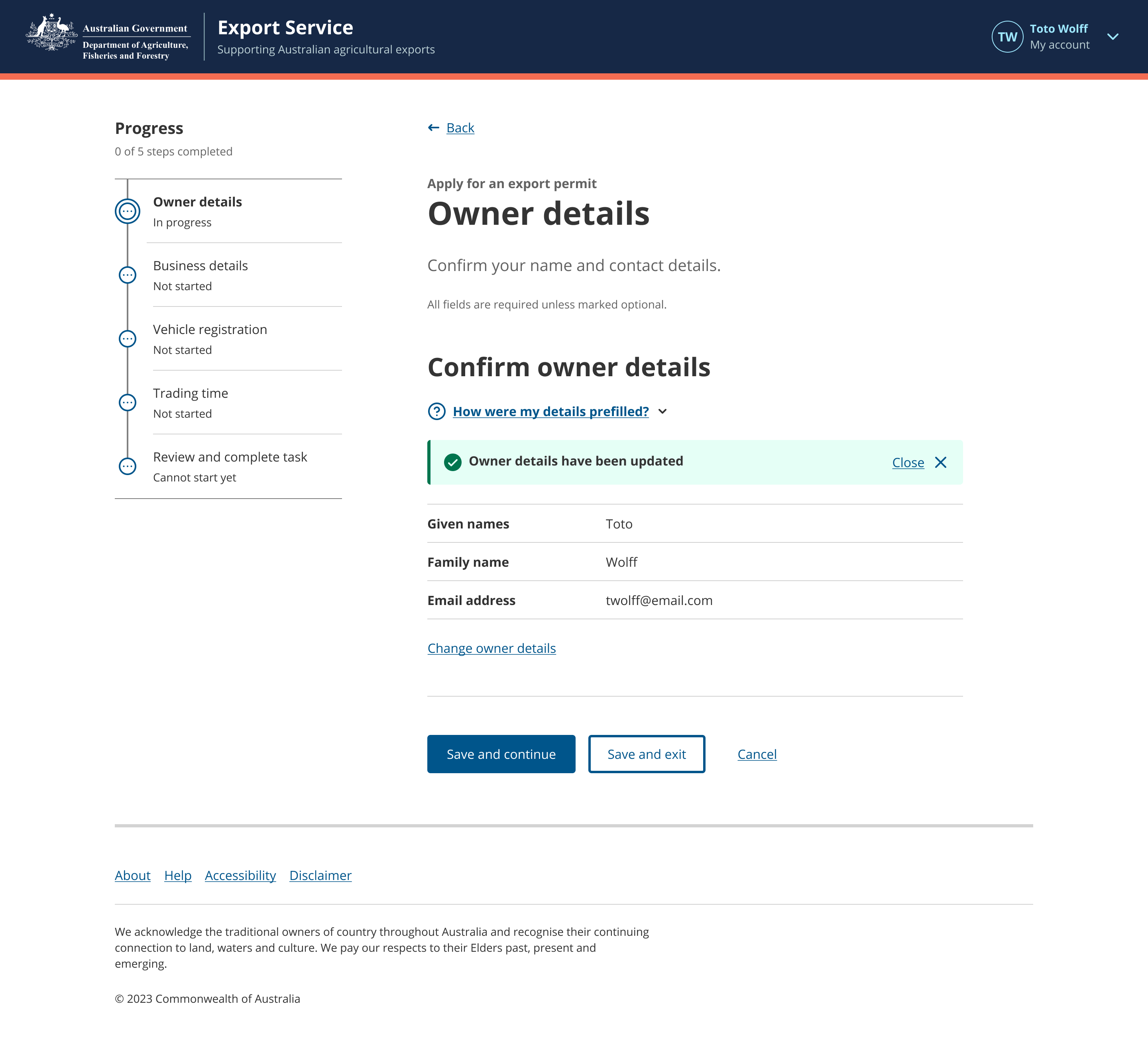
The level 2 step is a separate page, so it is displayed under the main level 1 step in the progress indicator. This helps the user understand where they are in the process.
Once the user saves their changes, they’re taken back to the main step page and a section alert is displayed to let them know that their changes were made successfully. The level 2 step is no longer displayed in the Progress indicator; it’s only displayed when the user is on the level 2 step page.
Notes
Colour
AgDS foreground components respond to the background colour of their parent container. When placed on a dark palette background, the dark palette variant of the component is displayed. When placed on a light palette background the light palette variant is displayed.
This logic ensures sufficient contrast between foreground and background elements is maintained to meet WCAG 2.1 AA, 4:5:1 contrast ratio for text (WCAG 1.4.3) and 3:1 for graphic elements that convey information (WCAG 1.4.11).
This component has a 'bodyAlt' variant. Components with a 'bodyAlt' variant utiliseshadeAlt to highlight interface components and content that sit on 'bodyAlt' background. shadeAlt is also used to fill interactive components, ensuring sufficient contrast is maintained for hover states.
Light palette
<Box background="body" paddingX={{ xs: 0.75, md: 1.5 }} paddingY={1.5}>
	<Columns cols={{ xs: 1, sm: 2 }} gap={0}>
		<Stack gap={1.5} padding={1.5}>
			<H4>Progress indicator: on light body background</H4>
			<ProgressIndicator
				activePath="#organisations"
				items={[
					{ label: 'Introduction', status: 'done', href: '#introduction' },
					{ label: 'Submit evidence', status: 'saved', href: '#evidence' },
					{ label: 'Organisations', status: 'started', href: '#organisations' },
					{ label: 'Business contacts', status: 'error', href: '#contacts' },
					{ label: 'Case studies', status: 'todo', href: '#case-studies' },
					{ label: 'Attachments', status: 'started', href: '#attachments' },
					{ label: 'Review and submit', status: 'blocked', href: '#review' },
				]}
			/>
		</Stack>
		<Stack background="bodyAlt" gap={1.5} padding={1.5}>
			<H4>Progress indicator: on light bodyAlt background</H4>
			<ProgressIndicator
				activePath="#organisations"
				background="bodyAlt"
				items={[
					{ label: 'Introduction', status: 'done', href: '#introduction' },
					{ label: 'Submit evidence', status: 'saved', href: '#evidence' },
					{ label: 'Organisations', status: 'started', href: '#organisations' },
					{ label: 'Business contacts', status: 'error', href: '#contacts' },
					{ label: 'Case studies', status: 'todo', href: '#case-studies' },
					{ label: 'Attachments', status: 'started', href: '#attachments' },
					{ label: 'Review and submit', status: 'blocked', href: '#review' },
				]}
			/>
		</Stack>
	</Columns>
</Box>
Dark palette
<Box background="body" paddingX={{ xs: 0.75, md: 1.5 }} paddingY={1.5} palette="dark">
	<Columns cols={{ xs: 1, sm: 2 }} gap={0}>
		<Stack gap={1.5} padding={1.5}>
			<H4>Progress indicator: on dark body background</H4>
			<ProgressIndicator
				activePath="#organisations"
				items={[
					{ label: 'Introduction', status: 'done', href: '#introduction' },
					{ label: 'Submit evidence', status: 'saved', href: '#evidence' },
					{ label: 'Organisations', status: 'started', href: '#organisations' },
					{ label: 'Business contacts', status: 'error', href: '#contacts' },
					{ label: 'Case studies', status: 'todo', href: '#case-studies' },
					{ label: 'Attachments', status: 'started', href: '#attachments' },
					{ label: 'Review and submit', status: 'blocked', href: '#review' },
				]}
			/>
		</Stack>
		<Stack background="bodyAlt" gap={1.5} padding={1.5}>
			<H4>Progress indicator: on dark bodyAlt background</H4>
			<ProgressIndicator
				activePath="#organisations"
				background="bodyAlt"
				items={[
					{ label: 'Introduction', status: 'done', href: '#introduction' },
					{ label: 'Submit evidence', status: 'saved', href: '#evidence' },
					{ label: 'Organisations', status: 'started', href: '#organisations' },
					{ label: 'Business contacts', status: 'error', href: '#contacts' },
					{ label: 'Case studies', status: 'todo', href: '#case-studies' },
					{ label: 'Attachments', status: 'started', href: '#attachments' },
					{ label: 'Review and submit', status: 'blocked', href: '#review' },
				]}
			/>
		</Stack>
	</Columns>
</Box>
Related components
- Task list – Task list is a navigation tool that show users what input is required to complete a task or transaction.