Hero banner
The hero banner sits at the top of the page under the Main nav and is used to grab a user’s attention.
import { ... } from '@ag.ds-next/react/hero-banner';Hero banner
<HeroBanner
	image={
		<img src="/img/placeholder/hero-banner.jpeg" role="presentation" alt="" />
	}
>
	<HeroBannerTitleContainer>
		<HeroBannerTitle>
			Website hero banner title - xxxl/display (H1)
		</HeroBannerTitle>
		<HeroBannerSubtitle>
			Short hero banner sentence - md/default (P)
		</HeroBannerSubtitle>
	</HeroBannerTitleContainer>
	<SearchBox onSubmit={() => {}}>
		<SearchBoxInput label="Search this website" />
		<SearchBoxButton iconOnly={{ xs: true, md: false }}>Search</SearchBoxButton>
	</SearchBox>
</HeroBanner>
Use the HeroBanner components on home or landing pages.
Do
- select an appropriate image
- adhere to brand guidelines
- use category and subcategory banners
- use search and button group properties
- use to introduce a new section or category
- write concise and short description lengths.
Don’t
- use on lower-level pages
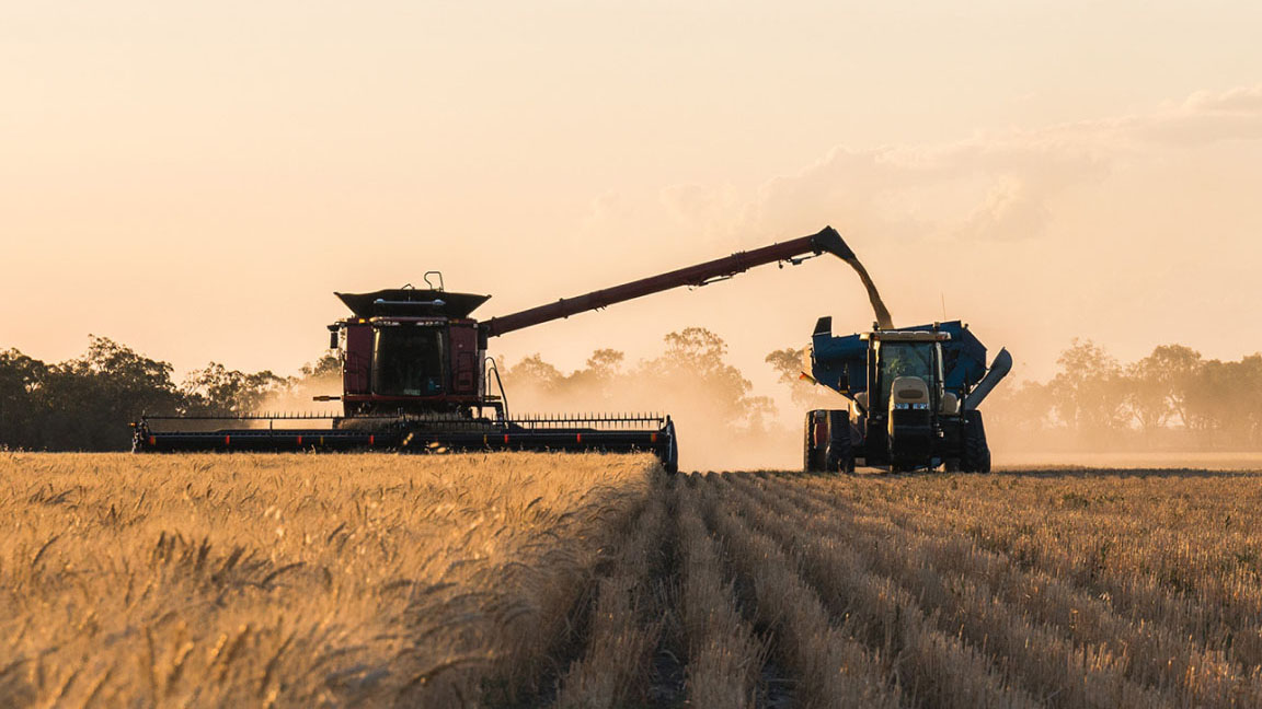
Image selection
Images in this component are automatically resized to fit their container using the object-fit CSS property. Because of this it is important to use images of an appropriate image ratio. You can reference the image size and ratio of our example image.
Hero category banner
Use the HeroCategoryBanner components for top level category pages.
<HeroCategoryBanner
	image={
		<img src="/img/placeholder/hero-banner.jpeg" role="presentation" alt="" />
	}
>
	<HeroCategoryBannerTitle>
		Website hero banner title - xxl/display (H1)
	</HeroCategoryBannerTitle>
	<HeroCategoryBannerSubtitle>
		Hero banner sub title (P).
	</HeroCategoryBannerSubtitle>
</HeroCategoryBanner>
Hero subcategory banner
Use the HeroSubcategoryBanner components pages within a category.
<HeroSubcategoryBanner>
	<Breadcrumbs
		links={[
			{ href: '#', label: 'Section 1' },
			{ href: '#', label: 'Category page' },
			{ label: 'Subcategory page' },
		]}
	/>
	<HeroSubcategoryBannerTitle>
		Subcategory banner title - xxl/display (H1)
	</HeroSubcategoryBannerTitle>
</HeroSubcategoryBanner>
Colour
AgDS foreground components respond to the background colour of their parent container. When placed on a dark palette background, the dark palette variant of the component is displayed. When placed on a light palette background the light palette variant is displayed.
This logic ensures sufficient contrast between foreground and background elements is maintained to meet WCAG 2.1 AA, 4:5:1 contrast ratio for text (WCAG 1.4.3) and 3:1 for graphic elements that convey information (WCAG 1.4.11).
This component has a 'bodyAlt' variant. Components with a 'bodyAlt' variant utiliseshadeAlt to highlight interface components and content that sit on 'bodyAlt' background. shadeAlt is also used to fill interactive components, ensuring sufficient contrast is maintained for hover states.
Light palette
<Box background="body" paddingX={{ xs: 0.75, md: 1.5 }} paddingY={1.5}>
	<Stack gap={1.5} paddingX={{ xs: 0.75, md: 1.5 }} paddingY={1.5}>
		<H4>Hero banner: on light body background</H4>
		<HeroBanner
			image={
				<img
					alt=""
					role="presentation"
					src="/img/placeholder/hero-banner.jpeg"
				/>
			}
		>
			<HeroBannerTitleContainer>
				<HeroBannerTitle>
					Website hero banner title
				</HeroBannerTitle>
				<HeroBannerSubtitle>
					Short hero banner sentence
				</HeroBannerSubtitle>
			</HeroBannerTitleContainer>
			<SearchBox onSubmit={() => console.log()}>
				<SearchBoxInput label="Search this website" />
				<SearchBoxButton iconOnly={{ xs: true, md: false }}>Search</SearchBoxButton>
			</SearchBox>
		</HeroBanner>
	</Stack>
	<Stack background="bodyAlt" gap={1.5} paddingX={{ xs: 0.75, md: 1.5 }} paddingY={1.5}>
		<H4>Hero banner: on light bodyAlt background</H4>
		<HeroBanner
			background="shadeAlt"
			image={
				<img
					alt=""
					role="presentation"
					src="/img/placeholder/hero-banner.jpeg"
				/>
			}
		>
			<HeroBannerTitleContainer>
				<HeroBannerTitle>
					Website hero banner title
				</HeroBannerTitle>
				<HeroBannerSubtitle>
					Short hero banner sentence
				</HeroBannerSubtitle>
			</HeroBannerTitleContainer>
			<SearchBox onSubmit={() => console.log()}>
				<SearchBoxInput label="Search this website" />
				<SearchBoxButton iconOnly={{ xs: true, md: false }}>Search</SearchBoxButton>
			</SearchBox>
		</HeroBanner>
	</Stack>
</Box>
Dark palette
<Box background="body" paddingX={{ xs: 0.75, md: 1.5 }} paddingY={1.5} palette="dark">
	<Stack gap={1.5} paddingX={{ xs: 0.75, md: 1.5 }} paddingY={1.5}>
		<H4>Hero banner: on dark body background</H4>
		<HeroBanner
			image={
				<img
					alt=""
					role="presentation"
					src="/img/placeholder/hero-banner.jpeg"
				/>
			}
		>
			<HeroBannerTitleContainer>
				<HeroBannerTitle>
					Website hero banner title
				</HeroBannerTitle>
				<HeroBannerSubtitle>
					Short hero banner sentence
				</HeroBannerSubtitle>
			</HeroBannerTitleContainer>
			<SearchBox onSubmit={() => console.log()}>
				<SearchBoxInput label="Search this website" />
				<SearchBoxButton iconOnly={{ xs: true, md: false }}>Search</SearchBoxButton>
			</SearchBox>
		</HeroBanner>
	</Stack>
	<Stack background="bodyAlt" gap={1.5} paddingX={{ xs: 0.75, md: 1.5 }} paddingY={1.5}>
		<H4>Hero banner: on dark bodyAlt background</H4>
		<HeroBanner
			background="shadeAlt"
			image={
				<img
					alt=""
					role="presentation"
					src="/img/placeholder/hero-banner.jpeg"
				/>
			}
		>
			<HeroBannerTitleContainer>
				<HeroBannerTitle>
					Website hero banner title
				</HeroBannerTitle>
				<HeroBannerSubtitle>
					Short hero banner sentence
				</HeroBannerSubtitle>
			</HeroBannerTitleContainer>
			<SearchBox onSubmit={() => console.log()}>
				<SearchBoxInput label="Search this website" />
				<SearchBoxButton iconOnly={{ xs: true, md: false }}>Search</SearchBoxButton>
			</SearchBox>
		</HeroBanner>
	</Stack>
</Box>