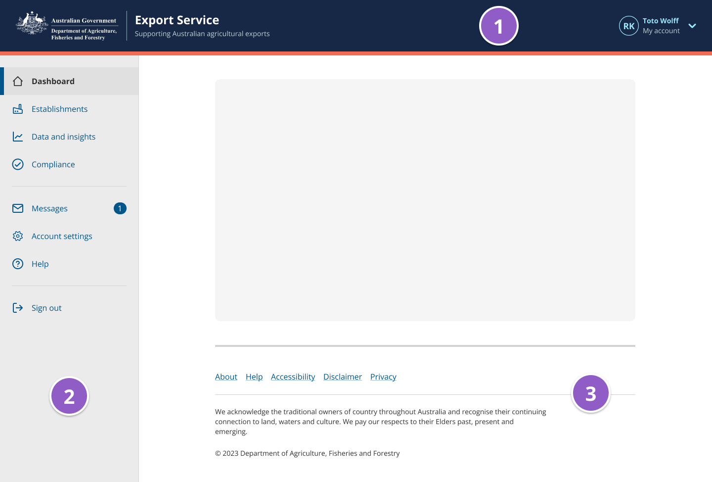
App layout
The app layout provides a consistent way for users to navigate around a web application and access their account settings.
import { ... } from '@ag.ds-next/react/app-layout';Overview
The app layout is a single component that consists of 3 parts. All 3 parts should be used together across all pages of a web application.
Use the app layout for web applications, not informational websites, as the layout is better suited to task-oriented interactions.
Usage guidelines
Do
- use the app layout for web applications i.e. task oriented websites that users generally need to sign in to access.
- use the app layout consistently on all pages of an application
- display the app layout sidebar by default on general app pages
- hide the app layout sidebar for forms to support user focus
- use all parts of the app layout always
Don’t
- use the app layout for informational websites, use the informational website templates instead: home page, category page, subcategory page, and content page
- use some parts of this component and not others, they should always be used together.
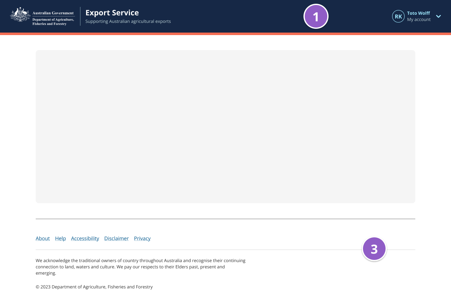
App layout header
The app layout header tells users what application they’re using and displays the logo.
-
Heading and subline - The heading should be set to the website or service title and the subline can be used to provide additional information to describe your website or service.
-
Account details - A user’s name and avatar or entity information should be displayed in the top right corner to clearly show which account they’re signed in to. Users can access their account settings via the dropdown.
Co-branding
The app layout header component can be used with no logo, one logo, or two logos when the Australian Government Brand Guidelines for Program or International branding are met. Each logo can be a link when an href and secondHref are defined.
Note: The first logo’s href will be assigned to the heading and subLine text as well.
App layout sidebar
The app layout sidebar houses the main navigational menu which provides users with a consistent way to navigate around a web application.
Each menu item can have an optional icon on the left to help users scan the menu faster. Menu items can also have a Notification badge on the right to indicate the number of notifications.
The app layout sidebar should be hidden while users are completing multi-page forms. This is known as focus mode and is intended to reduce distractions and cognitive load.
Sub-level items
When choosing if sub-level items should be always visible or only visible when active you should consider:
- How many sub-level items will each top-level item have?
- Do users need to see sub-level items to understand the structure of your site?
- Do users need to jump to sub-level items quickly to complete frequent tasks?
- Will visible sub-level items cause excessive scrolling or tab stops for keyboard users?
Visible when active
Sub-level items can be revealed when the parent item is active. This approach is best when the number of visible items in the list will increase cognitive load, for example by causing excessive scrolling and tab stops for keyboard users.
Visible when active is the default behaviour. Setting subLevelVisible="whenActive" or omitting this prop will result in sub-level links that are only visible when active.
Always visible
Making sub-level items always visible will help users if:
- you have a small number of items and it’s easy for users to see all items at once without excessive scroll or tab stops,
- it will help users understand the structure of your site,
- you know users need to jump to sub-levels to quickly to complete frequent tasks.
Setting subLevelVisible="always" will result in sub-links that are always visible.
App layout footer
The footer lives at the bottom of a page and generally contains copyright information and links to other sections of the website application.
Related patterns
- Focus mode – Used to help reduce distractions so that users can focus on completing a specific task.