Focus mode
Used to help reduce distractions so that users can focus on completing a specific task.
Focus mode refers to temporarily hiding the main navigation of a website or application to reduce distractions and cognitive load.
Do
- use focus mode on multi-page forms
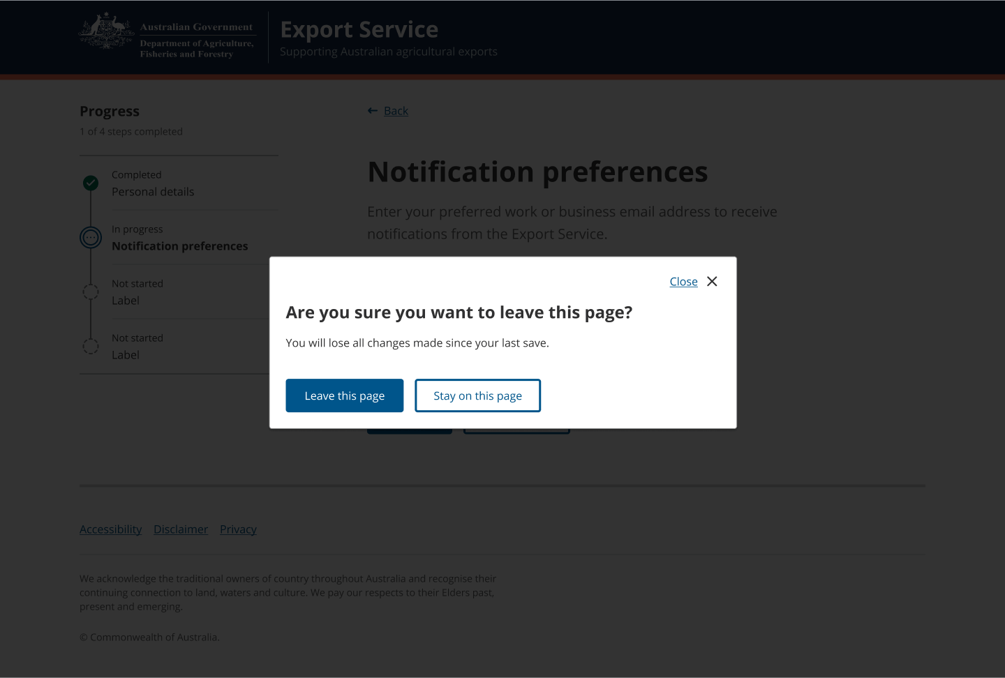
- trigger a Modal dialog if users navigate away from the form flow to help prevent them from losing data
- always ensure the user can escape focus mode and return to standard navigation patterns via a ‘back’, ‘save and exit’ or ‘cancel’ button.
Don’t
- allow users to control whether focus mode is on or off, it should be controlled by the system
- use focus mode on information website content pages where a user needs to access navigation.
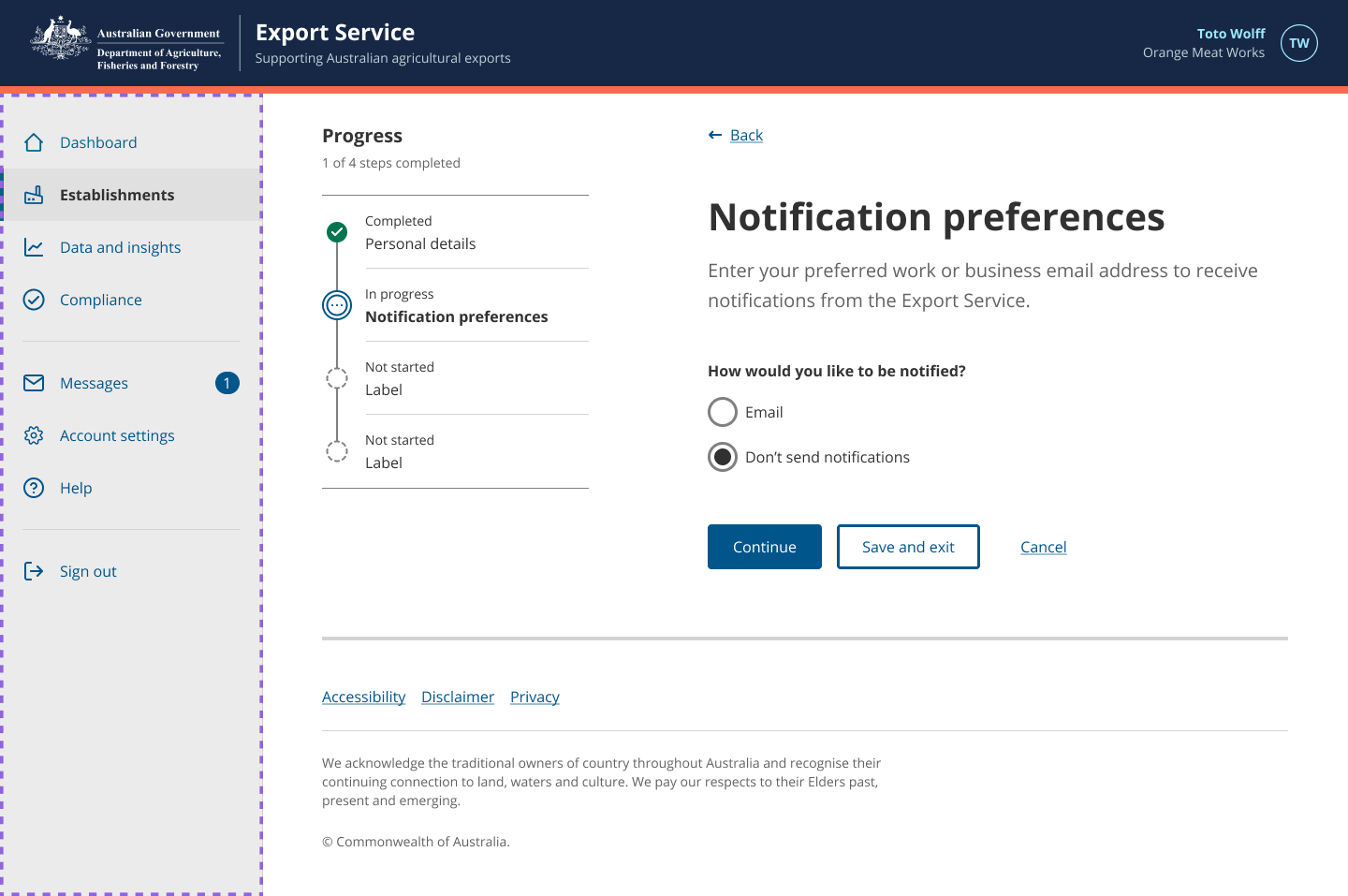
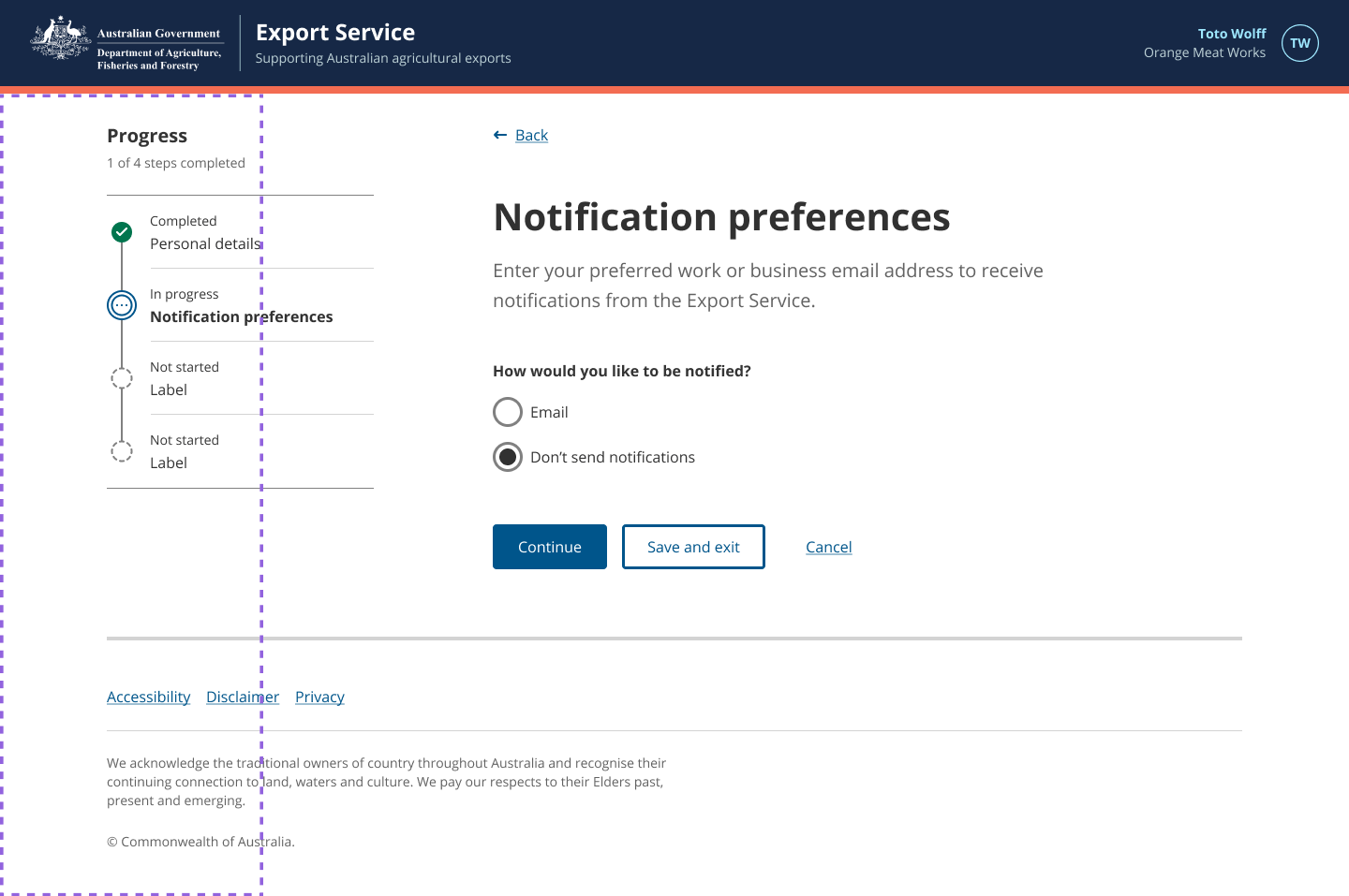
Focus mode in App layout
The App layout sidebar should be hidden while users are completing multi-page forms to reduce distractions and cognitive load. This can be achieved by setting the focusMode prop to true on the AppLayout component.
Don’t
Display the App layout sidebar with the Progress indicator, as they’re both navigational items that compete for attention. Displaying both on the screen also limits space for the main content.
Do
Remove the Main nav on informational website multi-page forms to simplify the screen, reduce distractions and the risk of users accidently navigating away from the form flow.
Don’t
Use focus mode on informational website content pages where a user needs to access navigation.
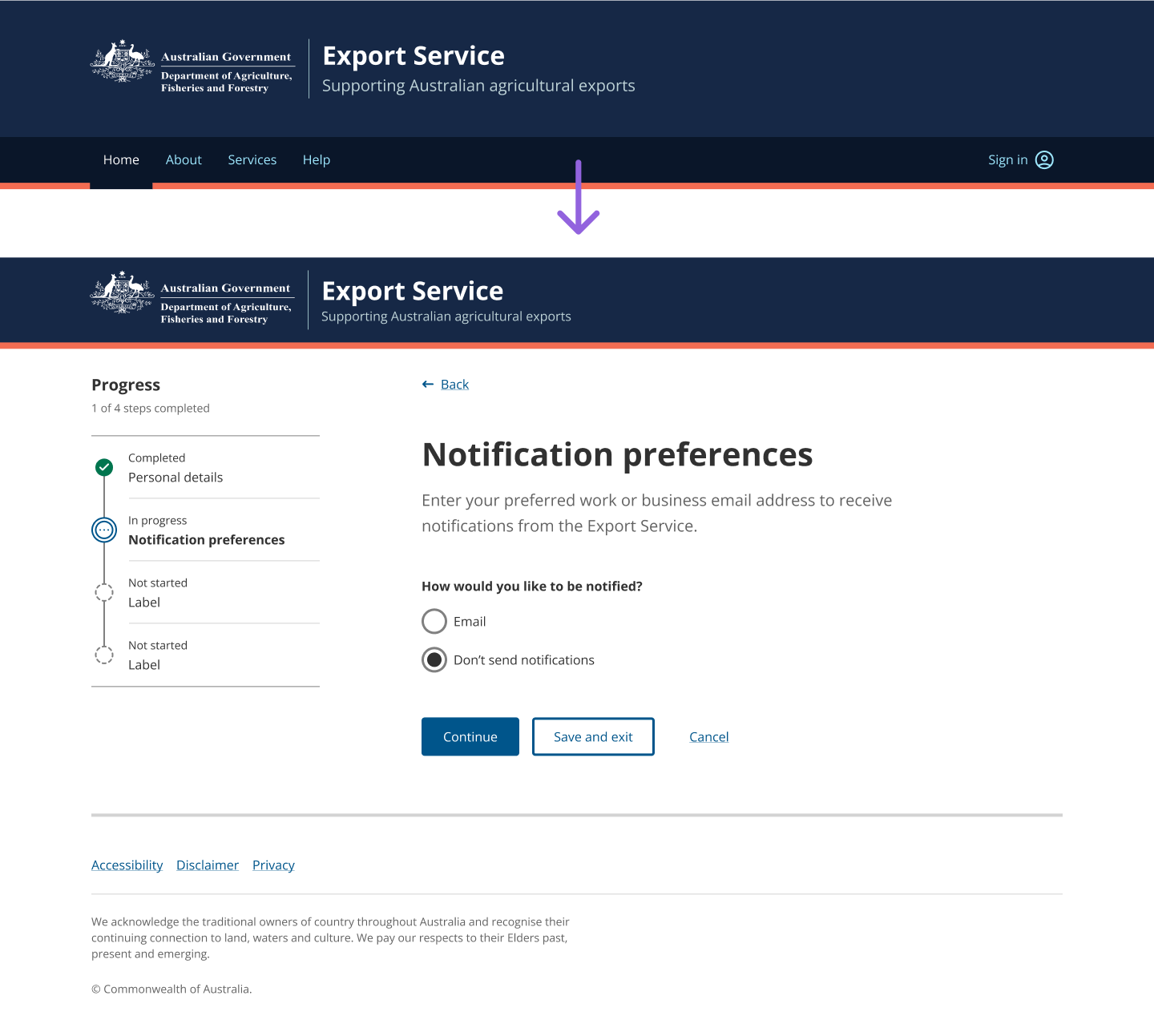
Focus mode in informational websites
On informational websites, focus mode hides the main navigation and changes the header component to the small variant to save vertical space.
To do this, please refer the code example in the example site.
Do
Remove the App layout sidebar to simplify the screen, reduce distractions and the risk of users accidently navigating away from the form flow.
Modal dialog
Even though focus mode hides the main navigation, users could still navigate away from the form via the links in the header, footer, or even the browser back button. To help prevent users from losing data they’ve already entered into a form, trigger a Modal dialog in case they mistakenly navigated away from the form.
Related components
- App layout – The app layout provides a consistent way for users to navigate around a web application and access their account settings.
- Header – The Header is the masthead of our applications. It incorporates the Department of Agriculture, Fisheries and Forestry Coat of Arms logo and provides a user context on where they are.
- Main nav – The main nav is the primary way users navigate the user interface. It is consistently visible throughout the service.
- Modal – A modal is a dialog box that appears above the parent page and provides advance notice of a destructive action and consequence. They tell users a decision is needed.