Search filters
Search filters help users find what they’re looking for by displaying options that meet specified criteria.
Search filters help users find what they’re looking for by displaying options that meet specified criteria.
Applied filters are displayed as tags, so users can quickly see which filters have been applied to the dataset. Filters can be removed by dismissing the tags.
The dataset should be displayed in a Table or a list of Cards under the search filters. Refer to the specific component guidance to help determine which is more suitable to display your dataset.
<Stack gap={3}>
	<Stack gap={1}>
		<Flex
			gap={1}
			justifyContent="space-between"
			flexDirection={['column', 'row']}
		>
			<Flex
				flexDirection={['column', 'row']}
				gap={1}
				alignItems={['flex-start', 'flex-end']}
			>
				<div aria-label="Site" role="search">
					<SearchInput label="Search" hideOptionalLabel />
				</div>
				<Button variant="secondary" iconAfter={FilterIcon}>
					Show filters
				</Button>
			</Flex>
			<Select
				label="Sort by"
				hideOptionalLabel
				options={[
					{ value: 'newest', label: 'Newest to oldest' },
					{ value: 'old', label: 'Oldest to newest' },
				]}
			/>
		</Flex>
		<Flex flexWrap="wrap" gap={0.75} alignItems="flex-end">
			<Tags
				heading={<Text fontWeight="bold">Active filters</Text>}
				items={[
					{ label: 'Category: Plant', onRemove: console.log },
					{ label: 'Type: Organic', onRemove: console.log },
					{ label: 'Assignee: John', onRemove: console.log },
				]}
			/>
			<Button
				size="sm"
				variant="text"
				onClick={console.log}
				iconAfter={CloseIcon}
			>
				Clear filters
			</Button>
		</Flex>
		<Divider />
	</Stack>
	<Stack gap={1}>
		<H2>
			<span role="status">25 results</span>
		</H2>
		{Array.from(Array(5).keys()).map((idx) => (
			<Card key={idx} shadow clickable>
				<CardInner>
					<Stack gap={1}>
						<H3>
							<CardLink href="#">Card heading</CardLink>
						</H3>
						<Text as="p">
							Lorem ipsum dolor, sit amet consectetur adipisicing elit. In,
							voluptat
						</Text>
					</Stack>
				</CardInner>
			</Card>
		))}
	</Stack>
	<PaginationButtons
		currentPage={5}
		totalPages={10}
		onChange={(page) => console.log(page)}
	/>
</Stack>
Do
- choose the right filter pattern to meet user needs
- prioritise filters by expected usage
- display 1-2 of the most important filters above the dataset
- include loading, empty, and error states
Don’t
- remove the applied filter tags, as they allow users to see and remove active filters
Filter inputs
Filters can be made of from multiple input types including:
Filter sizes
Filters are available in 3 sizes to accommodate a wide range of use cases and data sets:
- Small: 1-2 filters
- Medium: 3-6 filters
- Large: 6+ filters
Small | Medium | Large | |
|---|---|---|---|
Number of filters | 1-2 | 3-6 | 6+ |
Number of primary filters | 1-2 | 1-2 | 1-2 |
Tags display active filters | No | Yes | Yes |
Submission required | No | No | Yes |
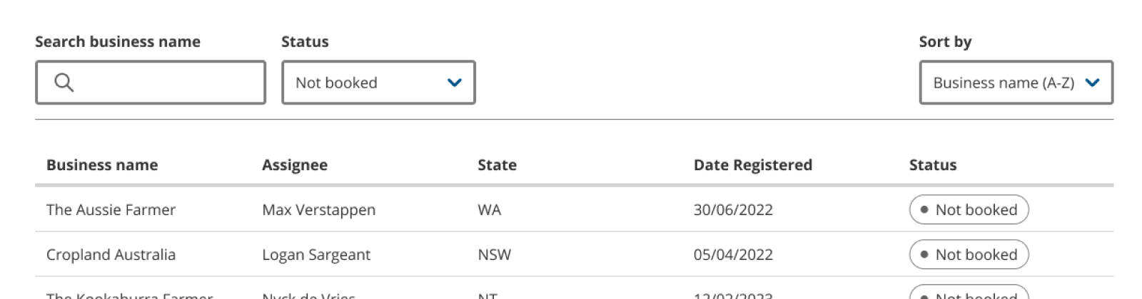
Small
1-2 visible filters sit above the dataset. Tags that display active filters are not needed in this case, as the filters are always visible.
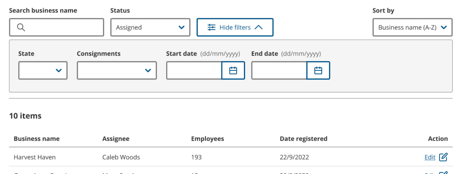
Medium
3-6 filters are displayed in an accordion that is triggered by a ‘Show filters’ button.
1 to 2 of the most used filters can be displayed outside the accordion to make them easier and faster to access.
Applied filters are displayed as tags under the filter inputs. This helps users quickly see which filters have been applied. Filters can be removed by dismissing the tags.
Large
6 or more filters are displayed in a drawer that is triggered by a ‘Show filters’ button. The drawer has a submit button that applies the filters.
1 to 2 of the most used filters can be displayed outside the drawer to make them easier and faster to access.
Applied filters are displayed as tags under the filter inputs. This helps users quickly see which filters have been applied. Filters can be removed by dismissing the tags.
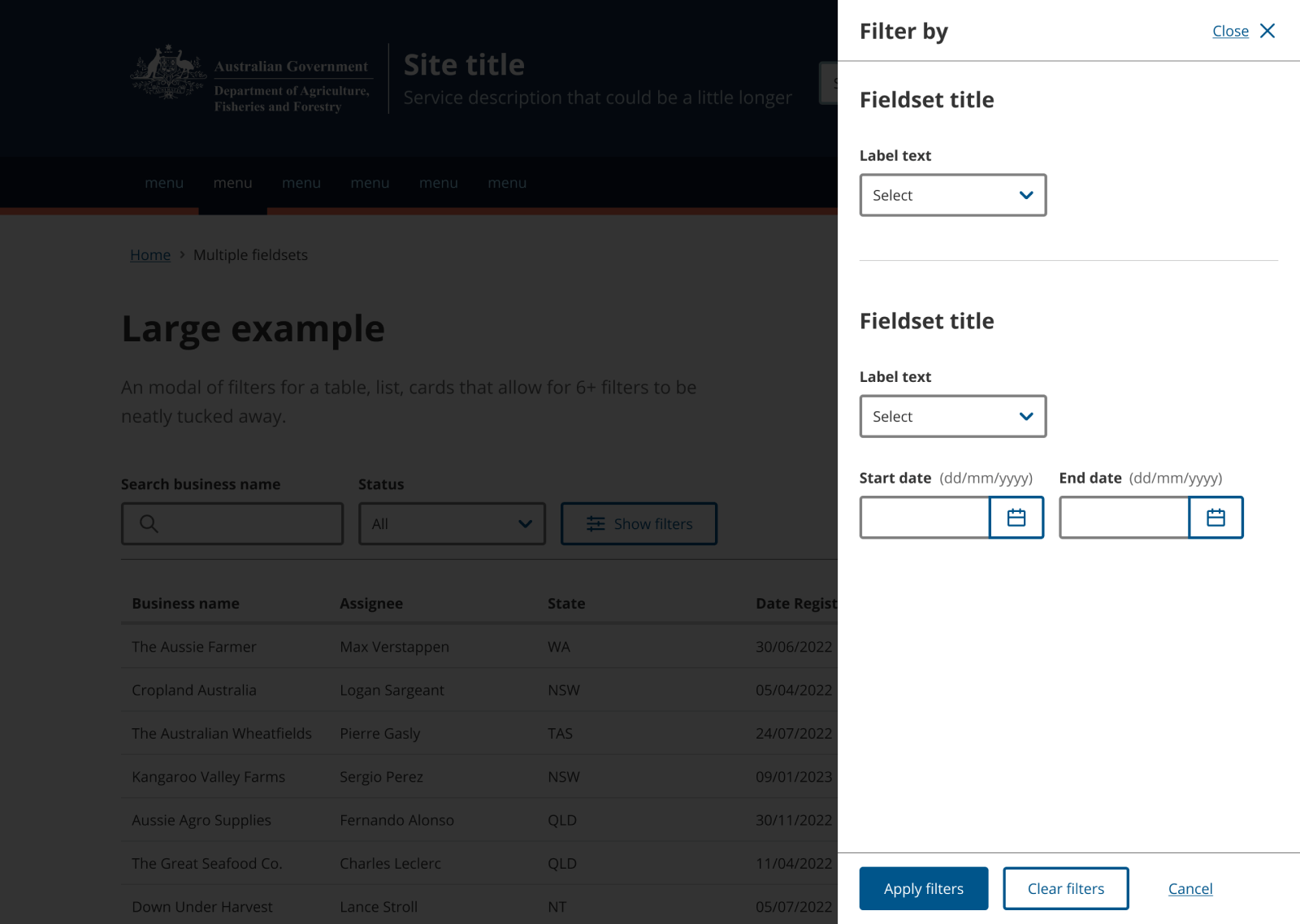
Actions in drawer
The Drawer component should contain a total of 4 actions:
- Apply filters button: When pressed, filters should be applied and the drawer should be closed.
- Clear filters button: When pressed, filters should be reset to their original state. The drawer should stay open.
- Close button: When pressed, the drawer should close. Any changes that have been made since opening the drawer should be discarded. This is essentially the same as the ‘Cancel’ button.
- Cancel button: When pressed, the drawer should close. Any changes that have been made since opening the drawer should be discarded. This is essentially the same as the ‘Close’ button.
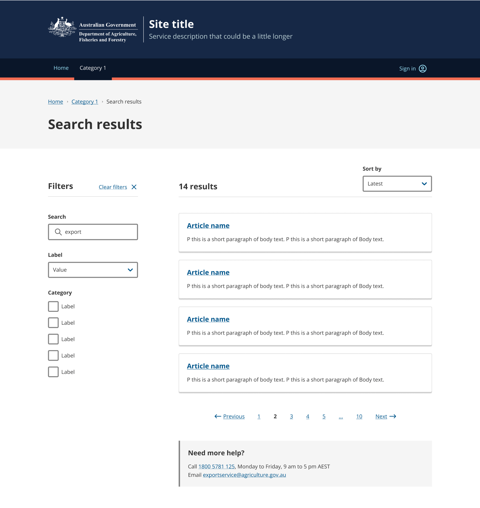
Search filter sidebar
If you have filters that need to be quickly accessed on a regular basis, you could consider putting them in a Filter sidebar on the left so that they are always visible. The filter sidebar makes it faster and easier for users to access filters.
Ensure that the correct HTML order is maintained by including a hero banner at the top, followed by the filter sidebar on the left, and the card listing on the right.
Since the filters are always visible, there is no need to also include tags to show the active filters.
Empty state
When a search filter doesn’t match any data, use an empty state to let users know that they need to clear or change the search filter.
<Stack gap={3}>
	<Stack gap={1}>
		<Flex
			gap={1}
			justifyContent="space-between"
			flexDirection={['column', 'row']}
		>
			<Flex
				flexDirection={['column', 'row']}
				gap={1}
				alignItems={['flex-start', 'flex-end']}
			>
				<SearchInput label="Search" hideOptionalLabel />
				<Button variant="secondary" iconAfter={FilterIcon}>
					Show filters
				</Button>
			</Flex>
			<Select
				label="Sort by"
				hideOptionalLabel
				options={[
					{ value: 'newest', label: 'Newest to oldest' },
					{ value: 'old', label: 'Oldest to newest' },
				]}
			/>
		</Flex>
		<Divider />
	</Stack>
	<Stack gap={2} alignItems="flex-start" role="alert">
		<Stack gap={1}>
			<HelpIcon size="lg" color="muted" />
			<Heading type="h2" fontSize="lg">
				No results found
			</Heading>
			<Text>Try adjusting your filter options.</Text>
		</Stack>
		<Button variant="secondary">Clear filters</Button>
	</Stack>
</Stack>
Templates
Coming soon
Related components
- Card – Cards are layout components used to link to more information or for secondary in-page navigation.
- Drawer – A drawer is a panel that slides in from the right side of the screen. The Drawer is overlayed on top of the main area of the page to capture the user’s attention while keeping the context of the current task.
- Filter sidebar – Filter sidebar is used for displaying filtering options in a search result or catalogue page.
- Pagination – Pagination separates large amounts of content into separate pages, which helps reduce cognitive load.
- Table – Tables help make complex information easier to scan and compare. Use tables for exact values or information that would be hard to read in body text.