Create, read, update and delete data in tables
Applications that require persistent data storage commonly require table layouts to present stored data. Here are some patterns that enable users to create, read, update and delete persistent data in tables.
Overview
Use CRUD table interactions to help users to Create, Read, Update or Delete (CRUD) data presented in tables. These common interactions can be achieved by providing an additional drawer or subpage surface for the action, to reduce the length and complexity of the form page and to provide the user content that is relevant to the interaction through progressive disclosure.
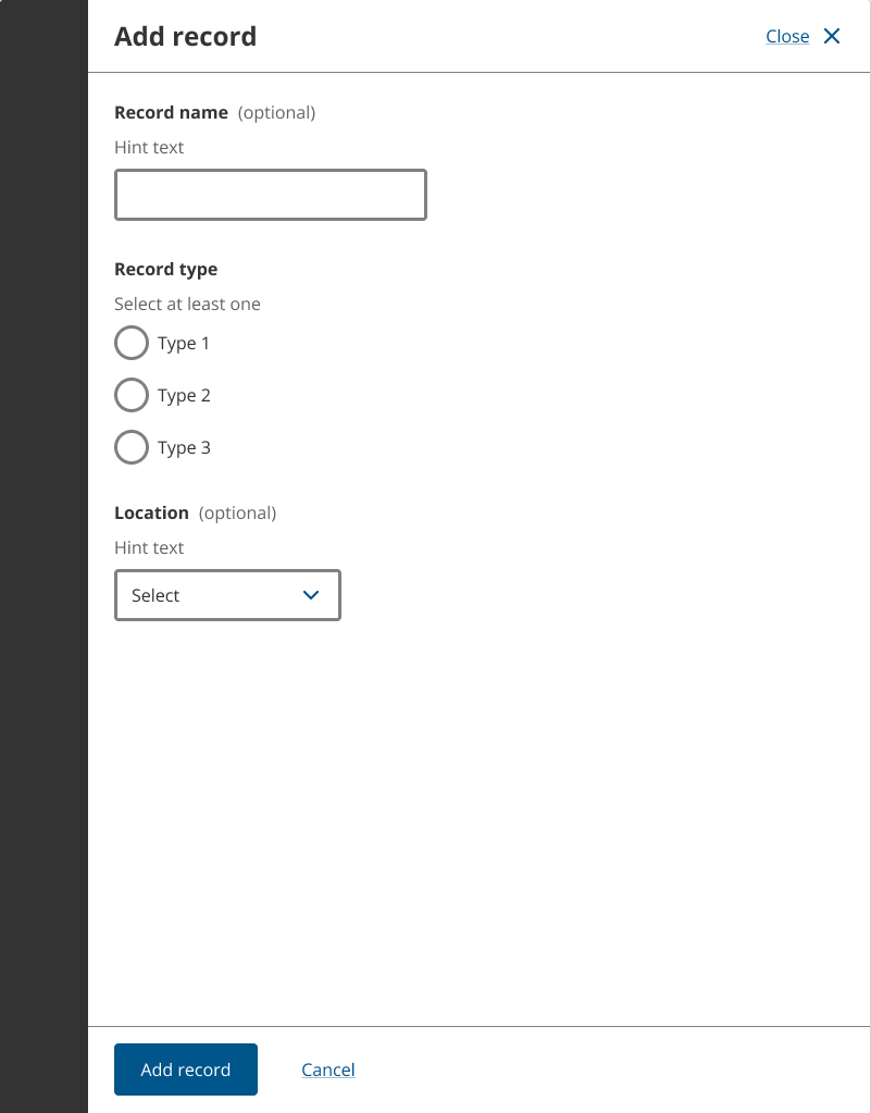
Create a record in a data table
When the primary action for a page is to create and add a record to a data table, provide an appropriate, primary button immediately before the table so it is above the table in the reading order and page hierarchy.
When creating a record is a secondary or supplementary action of the page, provide a small, secondary button immediately after the table.
Before any records have been added to a data table, provide an empty state to inform users there are no available records.
<Stack gap={3}>
	<Stack gap={1.5}>
		<H1>
			<Text
				color="muted"
				display="block"
				fontSize="sm"
				fontWeight="bold"
				lineHeight="heading"
			>
				Form title
			</Text>
			Create a record in this data table
		</H1>
		<Text as="p" color="muted" fontSize="md">
			Add other equipment
		</Text>
	</Stack>
	<Stack gap={2} alignItems="flex-start">
		<H2>Table of persistent data records</H2>
		<Stack gap={1}>
			<InfoIcon size="lg" />
			<Heading type="h2" fontSize="lg">
				No records added
			</Heading>
			<Text>You must add an equipment to proceed.</Text>
		</Stack>
		<ButtonGroup>
			<Button variant="secondary" size="sm" iconBefore={PlusIcon}>
				Add record
			</Button>
		</ButtonGroup>
	</Stack>
</Stack>
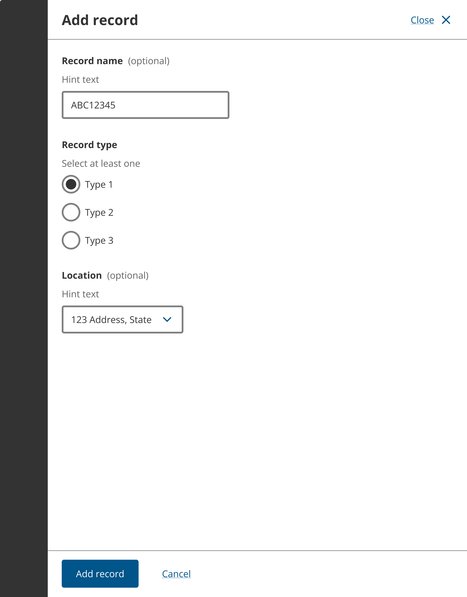
In most situations, use a side drawer or side page containing all of the form inputs and controls necessary to add a new record. Use drawer when the form is small or side pages for longer forms that a user will need to scroll.
Once the form used for adding a record to the table has been submitted, return the user to the table page and display the new record as a row in the table. Show a section alert immediately above the table to show success. Focus the section alert so the change is announced to screen reader users.
The add record to table pattern is repeatable and scalable.
<Stack gap={3}>
	<Stack gap={1.5}>
		<H1>
			<Text
				color="muted"
				display="block"
				fontSize="sm"
				fontWeight="bold"
				lineHeight="heading"
			>
				Form title
			</Text>
			Create a record in this data table
		</H1>
		<Text as="p" color="muted" fontSize="md">
			Introductory paragraph.
		</Text>
	</Stack>
	<SectionAlert
		onClose={console.log}
		title="ABC123456 was added to records"
		tone="successHigh"
	/>
	<Stack gap={2}>
		<H2>Table of persistent data records</H2>
		<TableWrapper>
			<Table>
				<TableHead>
					<TableRow>
						<TableHeader scope="col">Record name</TableHeader>
						<TableHeader scope="col">Record type</TableHeader>
						<TableHeader scope="col">Location</TableHeader>
						<TableHeader scope="col">Actions</TableHeader>
					</TableRow>
				</TableHead>
				<TableBody>
					<TableRow>
						<TableCell as="th" fontWeight="bold" scope="row">
							<TextLink href="#" id="ABC123456">
								ABC123456
							</TextLink>
						</TableCell>
						<TableCell>Type 1</TableCell>
						<TableCell>123 Address, State</TableCell>
						<TableCell>
							<Flex gap={1}>
								<TextLink aria-describedby="ABC123456" href="#">
									Edit
								</TextLink>
								<TextLink aria-describedby="ABC123456" href="#">
									Delete
								</TextLink>
							</Flex>
						</TableCell>
					</TableRow>
				</TableBody>
			</Table>
		</TableWrapper>
		<ButtonGroup>
			<Button variant="secondary" size="sm" iconBefore={PlusIcon}>
				Add record
			</Button>
		</ButtonGroup>
	</Stack>
</Stack>
Read a record in a data table
Provide a link in the first column of the table so users can open and read a record. The record number or other unique identifier should be made bold and used for the link label.
Provide a side drawer or side page to provide the record information. Use side drawers for small records or side pages for longer records that a user will need to scroll.
After a user has read the record, return them to the table page.
Reading a record in a table is repeatable and scalable pattern.
Update a record in a data table
Provide an ‘Edit’ link or button in the last column of the table so users can open and update or edit existing records. If more than two actions can be performed on a record, put them within an ‘Actions’ dropdown menu instead.
When a user activates the ‘Edit’ action, open a side drawer or side page containing all of the pre-filled form inputs and controls necessary to edit the record. We do not endorse editing content in-place within tables, as form inputs within table cells compromise accessibility and are difficult for some users.
After the record is edited in the side page or drawer, return the user to the table page with the updated record showing in the table. Provide a section alert immediately above the table to show success and focus it to announce the change to screen reader users.
The update or edit pattern is repeatable and scalable.
Delete a record from a data table
Provide a ’Delete’ button in the last column of the table so users can delete existing records. Delete can be included in a dropdown menu of actions in the last column if there more than two actions are available.
If the table supports batch actions, more than one record can be deleted at the same time.
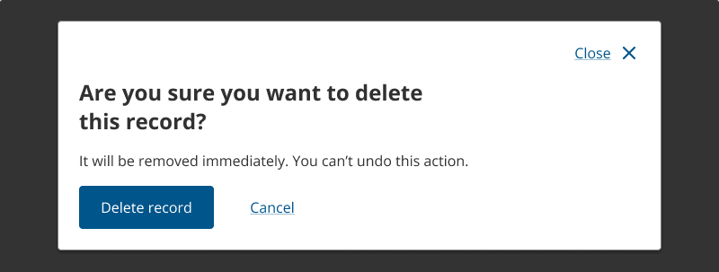
Before any record is deleted provide, a destructive action modal to make sure a user purposely intends to remove the record.
After the record is deleted, remove the record from the table, and provide a section alert immediately above the table to show success. Focus the section alert so the change is announced to screen reader users.
The delete pattern is repeatable and scalable.
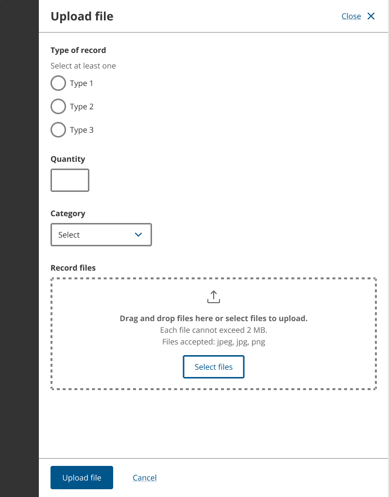
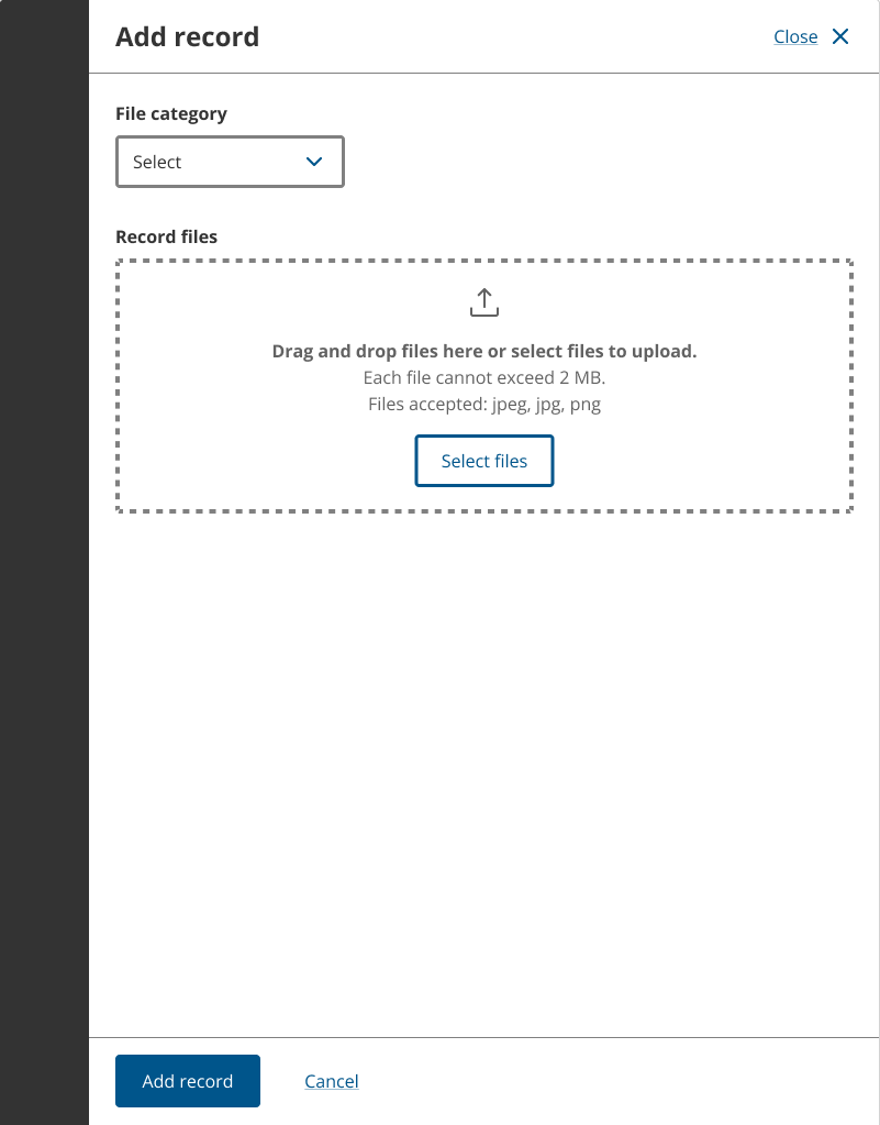
Upload an unspecified list of files to a table
Use a repeatable file upload pattern when uploading an unspecified list of files of different categories or when specific metadata for each file is required. Metadata can be associated with uploaded files when using this pattern to support back stage processing.
The upload unspecified list of files pattern reduces the amount of form content on the parent page making it easier for users to complete the form, and keeps the user’s context and focus when providing all required metadata in the side drawer or subpage.
Empty state
Before any files are uploaded, provide an empty state. Use a standard empty state rather than an empty table because the experience of the empty state is simpler for many users. Screen reader users will not need to navigate through a table to find out it is empty.
<Stack gap={3}>
	<Stack gap={1.5}>
		<H1>Upload unspecified list of files to data table (repeatable)</H1>
	</Stack>
	<Stack gap={2} alignItems="flex-start">
		<H2>List of equipment</H2>
		<Stack gap={1}>
			<InfoIcon size="lg" />
			<Heading type="h2" fontSize="lg">
				No equipment added
			</Heading>
			<Text>You must add an equipment to proceed.</Text>
		</Stack>
		<ButtonGroup>
			<Button variant="secondary" size="sm" iconBefore={PlusIcon}>
				Upload file
			</Button>
		</ButtonGroup>
	</Stack>
</Stack>
Side page or drawer
This pattern will direct the user to a subpage or side drawer to compete each upload task. The choice of subpage or drawer will be determined by the amount of content, inputs and controls required. We do not encourage side drawers that scroll, so use side pages for longer or more complex upload form pages. Try to choose one option, either side drawer or side page, that can be implemented consistently across the multi-page form or service it is used in.
Metadata for each uploaded file can be provided in a side drawer or side page containing the required inputs and controls. This pattern reduces the amount of form content on the parent page making it easier for users to complete the form. It keeps the user’s context and focus when providing all required metadata in the side drawer or side page.
File categorisation
The use of a subpage or drawer enables you to insert questions and fields specific to each file upload to define the record category or type, and provide any additional information required about an upload. Radio groups or selects can be used to help the user determine which category should be applied to an uploaded file.
Validation and focus
When a file is added in a subpage or drawer, return the user to the parent page and set their focus on a section alert to inform them if the upload was successful or an error has occurred.
The uploaded file should also be visible in a table or list on the parent page. Provide an edit or delete action in the table row or list to enable files to be changed.
<Stack gap={3}>
	<Stack gap={1.5}>
		<H1>Upload unspecified list of files to table (repeatable)</H1>
	</Stack>
	<SectionAlert
		onClose={console.log}
		title="FileName1.png was uploaded"
		tone="successHigh"
	/>
	<Stack gap={2}>
		<H2>List of equipment</H2>
		<TableWrapper>
			<Table>
				<TableHead>
					<TableRow>
						<TableHeader scope="col">Item</TableHeader>
						<TableHeader scope="col">Qty</TableHeader>
						<TableHeader scope="col">Files</TableHeader>
						<TableHeader scope="col">Actions</TableHeader>
					</TableRow>
				</TableHead>
				<TableBody>
					<TableRow>
						<TableCell>Type 1</TableCell>
						<TableCell>1</TableCell>
						<TableCell as="th" scope="row">
							FileName1.png
						</TableCell>
						<TableCell>
							<TextLink aria-describedby="FileName1.png" href="#">
								Remove
							</TextLink>
						</TableCell>
					</TableRow>
				</TableBody>
			</Table>
		</TableWrapper>
		<ButtonGroup>
			<Button variant="secondary" size="sm" iconBefore={PlusIcon}>
				Upload file
			</Button>
		</ButtonGroup>
	</Stack>
</Stack>
If a required file is not uploaded before the page is submitted, show an error in the row where the file is missing and provide a section alert above the table to assist with error correction.
Upload a defined list of files to a data table
A specific or defined list of files can be uploaded several ways. The number of items in the list and number of files for each list item will determine the appropriate pattern to use.
The upload defined list of files pattern reduces the amount of form content on the parent page, making it easier for users to complete the form and keeps the user’s context and focus when providing all required metadata in the side drawer or subpage.
Empty state
Before any files are uploaded, provide an empty state. Use a standard empty state rather than an empty table because the experience of the empty state is simpler for many users. Screen reader users will not need to navigate through a table to find out it is empty.
<Stack gap={3}>
	<Stack gap={1.5}>
		<H1>Upload defined list of files to data table</H1>
	</Stack>
	<Stack gap={2} alignItems="flex-start">
		<H2>List of equipment</H2>
		<Stack gap={1}>
			<InfoIcon size="lg" />
			<Heading type="h2" fontSize="lg">
				No equipment added
			</Heading>
			<Text>You must add an equipment to proceed.</Text>
		</Stack>
		<ButtonGroup>
			<Button variant="secondary" size="sm" iconBefore={PlusIcon}>
				Upload file
			</Button>
		</ButtonGroup>
	</Stack>
</Stack>
Large lists
When large, defined lists of files in tables are required, a drawer or subpage for each upload action should be used. The file upload component can be used in the side drawer or subpage to allow multiple files for each required category to be upload and added to a table.
File categorisation
The use of a subpage or drawer enables you to insert questions and fields specific to each file upload to define the record category or type, and provide any metadata related to an upload. Radio groups or selects can be used to help the user determine which category should be applied to an uploaded file.
Validation and focus
When a file is added in a subpage or drawer, return the user to the parent page and set their focus on a section alert to inform them if the upload was successful or an error has occurred.
The uploaded file should be visible in a table or list on the parent page. Provide an edit or remove action in the table row or list to enable the files to be changed.
<Stack gap={3}>
	<Stack gap={1.5}>
		<H1>Upload defined list of files to table</H1>
	</Stack>
	<SectionAlert
		onClose={console.log}
		title="FileName1.png was uploaded"
		tone="successHigh"
	/>
	<Stack gap={2}>
		<H2>List of files</H2>
		<TableWrapper>
			<Table>
				<TableHead>
					<TableRow>
						<TableHeader scope="col">Document type</TableHeader>
						<TableHeader scope="col">File</TableHeader>
						<TableHeader scope="col">Size</TableHeader>
						<TableHeader scope="col">Action</TableHeader>
					</TableRow>
				</TableHead>
				<TableBody>
					{[...Array(4).keys()].map((idx) => {
						return (
							<TableRow key={idx}>
								<TableCell>Required file category {idx + 1}</TableCell>
								<TableCell>
									<Box width="2rem" />
								</TableCell>
								<TableCell>
									<Box width="2rem" />
								</TableCell>
								<TableCell>
									<Button iconBefore={UploadIcon} variant="text">
										Upload
									</Button>
								</TableCell>
							</TableRow>
						);
					})}
				</TableBody>
			</Table>
		</TableWrapper>
		<ButtonGroup>
			<Button iconBefore={PlusIcon} size="sm" variant="secondary">
				Upload file
			</Button>
		</ButtonGroup>
	</Stack>
</Stack>
If a required file is not uploaded before the page is submitted, show an error in the row where the file is missing and provide a section alert above the table to assist with error correction.
<Stack gap={3}>
	<Stack gap={1.5}>
		<H1>Upload defined list of files to table</H1>
	</Stack>
	<SectionAlert
		onClose={console.log}
		title="You must provide all documents in the table below"
		tone="errorHigh"
	>
		<UnorderedList>
			<ListItem>Required file category 1 is required</ListItem>
			<ListItem>Required file category 2 is required</ListItem>
			<ListItem>Required file category 3 is required</ListItem>
		</UnorderedList>
	</SectionAlert>
	<Stack gap={2}>
		<H2>List of files</H2>
		<TableWrapper>
			<Table>
				<TableHead>
					<TableRow>
						<TableHeader scope="col">Document type</TableHeader>
						<TableHeader scope="col">File</TableHeader>
						<TableHeader scope="col">Size</TableHeader>
						<TableHeader scope="col">Action</TableHeader>
					</TableRow>
				</TableHead>
				<TableBody>
					{[...Array(3).keys()].map((idx) => {
						return (
							<TableRow invalid={true} key={idx}>
								<TableCell>Required file category {idx + 1}</TableCell>
								<TableCell>
									<Box width="5rem" />
								</TableCell>
								<TableCell>
									<Flex alignItems="center" gap={0.5}>
										<AlertFilledIcon color="error" />
										<Text>File missing</Text>
									</Flex>
								</TableCell>
								<TableCell>
									<Button iconBefore={UploadIcon} variant="text">
										Upload
									</Button>
								</TableCell>
							</TableRow>
						);
					})}
				</TableBody>
			</Table>
		</TableWrapper>
		<ButtonGroup>
			<Button iconBefore={PlusIcon} size="sm" variant="secondary">
				Upload file
			</Button>
		</ButtonGroup>
	</Stack>
</Stack>
Related components
- Button – A button communicates an action to a user and indicates what will happen next.
- File input – The File input component allows users to attach one file to a form field by browsing their device.
- File upload – The File upload component allows users to attach one or multiple files to a form via drag-and-drop or by browsing their device.
- Section alert – Section alerts are non-disruptive notifications that provide Success, Error, Warning, Information and Progress messages about a state change in a section of a page.
- Table – Tables help make complex information easier to scan and compare. Use tables for exact values or information that would be hard to read in body text.