Messaging
Messaging conveys contextual information to the user, provides information in relation to a service or interaction, and provides feedback in response to their actions or the current system status.
Global alert
Global alerts display prominent service or system wide messages at the top of the screen.
They are used to communicate system or service wide messages, not page or feature messages. Global alerts are not initiated by the user and should persist for a session but can be dismissed by the user.
<GlobalAlert title="Alert title">
	<Text as="p">
		Lorem ipsum dolor sit amet, consectetur adipiscing elit. Fusce massa nibh,
		aliquam vel dolor non, gravida porttitor nulla. Pellentesque cursus orci
		vulputate nibh sagittis blandit.
	</Text>
</GlobalAlert>
Page alert
Page alerts are colour-coded, non-disruptive notifications that provide Success, Error, Warning or Information messages at relevant times during the user journey.
Typically page alerts appear near the top of a page, under the H1 and introductory paragraph, following a submit action.
<PageAlert tone="error" title="There is a problem">
	<Text as="p">Please correct the following fields and try again</Text>
	<UnorderedList>
		<ListItem>
			<TextLink href="#">Full name must not be empty</TextLink>
		</ListItem>
		<ListItem>
			<TextLink href="#">Email must not be empty</TextLink>
		</ListItem>
	</UnorderedList>
</PageAlert>
Section alert
Section alerts are colour-coded, non-disruptive notifications that provide Success, Error, Warning or Information messages that are delivered in context at a specific section of the screen.
Section alerts should appear directly above an interactive component in a page section, and provide information or status following an action.
<SectionAlert title="Your changes have been saved" tone="successHigh" />
Invalid field
Invalid Fields alert the user of something that has happened in an input component. They appear above the input and after any label or hint text.
A border is added to the left-margin of the input to group the message to the component.
<TextInput
	label="Email"
	invalid
	message="Enter an email address in the correct format, like name@example.com"
/>
Callout
Callouts are used draw attention to persistent, important or interesting information and should not be used to communicate validation or status.
An information hierarchy can be created with Callouts by applying the Feature, Information and Neutral variants of the component. The Feature variant of Callout has a larger icon and heading to draw a user’s attention.
<Callout title="Callout heading">
	<Text as="p">Description of the callout.</Text>
</Callout>
Loading, empty and error states
When loading data in an application, it is important to consider and design for loading, empty, and error states. The compositions in our Loading, Error and Empty state patterns are designed to help you communicate these states to users.
<Stack gap={2} alignItems="flex-start" role="alert">
	<Stack gap={1}>
		<AlertFilledIcon color="error" size="lg" />
		<Heading type="h2" fontSize="lg">
			Failed to load
		</Heading>
		<Text>There was an error loading the data. Click retry to try again.</Text>
	</Stack>
	<Button>Retry</Button>
</Stack>
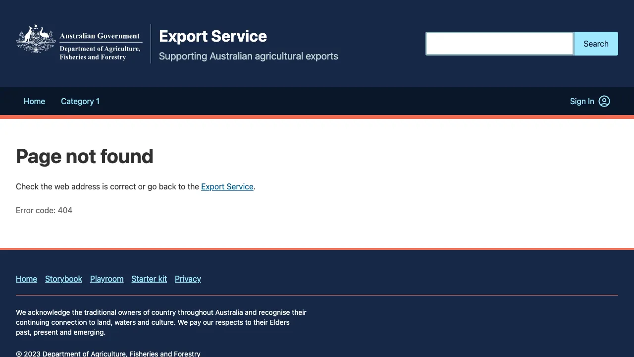
Error page template
The Error page template is used to display a full page error message to the user, if something goes wrong while loading the page.
This could include 404 errors, or if the application is down for maintenance.
Related components
- Callout – Callouts are an excerpt of text used to draw attention to important or interesting information. They should not be confused with Page alerts.
- Field – The field package exposes the elements around form inputs, and an API to compose them.
- Global alert – Global alerts display prominent service or system wide messages at the top of the screen.
- Page alert – Page alerts are colour-coded, non-disruptive notifications that provide Success, Error, Warning or Information messages at relevant times during the user journey. They should not be confused with Callouts.
- Section alert – Section alerts are non-disruptive notifications that provide Success, Error, Warning, Information and Progress messages about a state change in a section of a page.